Staring at a screen filled with jagged green and red lines can feel like trying to read ancient hieroglyphics without Rosetta Stone. If you’ve ever opened a crypto exchange app and wondered what those vertical bars mean, you’re not alone. Most beginners lose money because they trade based on gut feeling or news headlines rather than understanding the visual language of the market. But here is the truth: crypto trading charts are not random noise. They are historical records of human psychology-fear and greed-mapped out in real-time.
You don’t need a finance degree to read them. You just need to know what to look for. In this guide, we will strip away the jargon and show you exactly how to interpret price action, identify trends, and spot potential entry points using the same tools professional traders rely on in 2026.
The Basics: Understanding Chart Types
Before you dive into complex patterns, you need to choose the right chart type. Not all charts are created equal, and picking the wrong one is like trying to navigate with a map that only shows highways but no streets.
| Chart Type | Best For | Data Shown | Complexity |
|---|---|---|---|
| Line Chart | Long-term trend overview | Closing prices only | Low |
| Candlestick Chart | Detailed price action & reversals | Open, High, Low, Close (OHLC) | Medium |
| Bar Chart (OHLC) | Space-saving data density | Open, High, Low, Close (OHLC) | High |
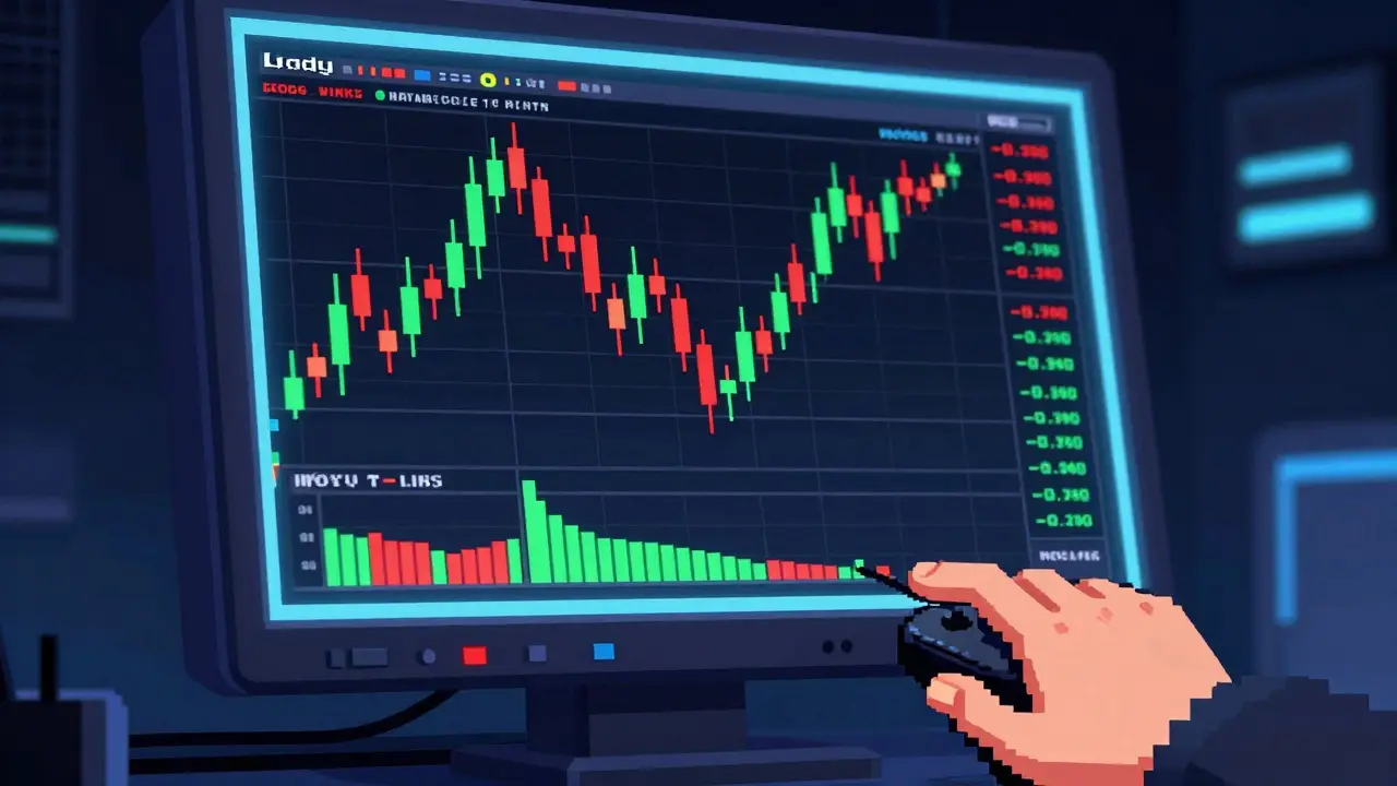
Candlestick charts are the industry standard for a reason. According to a 2025 Coinbase survey, nearly 90% of intermediate and advanced traders use them. Why? Because they tell a story within each time period. Each "candle" represents four specific data points: the opening price, the highest price reached, the lowest price dropped to, and the closing price.
The thick part of the candle is called the body. If the close is higher than the open, the body is typically green (or white), signaling bullish pressure. If the close is lower than the open, it’s red (or black), indicating bearish pressure. The thin lines sticking out from the top and bottom are called wicks or shadows. These show the extreme highs and lows that were rejected by the market during that period. A long upper wick means buyers pushed the price up, but sellers forced it back down-a sign of resistance. A long lower wick suggests sellers tried to push the price down, but buyers stepped in-a sign of support.
Line charts, on the other hand, connect only the closing prices. They are cleaner and less distracting, making them useful for spotting broad, long-term trends without getting bogged down by intraday volatility. However, they hide crucial information about price rejection and volume spikes, which is why most active traders avoid them for short-term decision-making.
Decoding Timeframes and Scales
One of the biggest mistakes beginners make is looking at the wrong timeframe. A pattern that looks like a guaranteed buy on a 1-minute chart might be insignificant noise on a daily chart. Timeframes determine your perspective.
- Scalpers (1-min to 15-min): Focus on rapid, small profits. High stress, high frequency. Requires strict discipline and low fees.
- Day Traders (1-hour to 4-hour): Enter and exit positions within the same day. Balances detail with broader context.
- Swing Traders (Daily to Weekly): Hold positions for days or weeks to capture larger moves. Less time-intensive, requires patience.
- Investors (Monthly): Focus on macroeconomic trends and multi-year cycles. Ignores short-term volatility entirely.
In 2026, the most common timeframe used by retail traders is the daily chart, selected by nearly 70% of users according to Kraken analytics. It filters out the "noise" of hourly fluctuations while still providing enough data points to identify meaningful trends.
Another critical setting is the price scale. Most platforms default to an arithmetic scale, where every inch on the Y-axis represents the same dollar amount. This works fine for stable assets. However, crypto often experiences exponential growth. An logarithmic scale adjusts for percentage changes, meaning a 10% move from $10 to $11 looks the same as a 10% move from $10,000 to $11,000. For analyzing Bitcoin’s long-term history, logarithmic scales are significantly more accurate, as they prevent early low-price movements from compressing recent high-price data into a flat line.
Identifying Support and Resistance
If there are only two concepts you take away from this article, let them be support and resistance. These are horizontal zones on the chart where price has historically struggled to break through.
Support is the floor. It’s a price level where buying interest is strong enough to overcome selling pressure, causing the price to bounce back up. Imagine a ball dropping onto a hard surface-it bounces. Multiple touches of a support level strengthen its significance. If the price breaks below support, that level often flips to become new resistance (a concept known as role reversal).
Resistance is the ceiling. It’s a price level where selling pressure overcomes buying interest, pushing the price back down. When price approaches resistance, traders often take profits, creating natural supply. If the price breaks above resistance with strong volume, that level becomes new support.
To find these levels, look for areas where the price has reversed direction multiple times in the past. Draw horizontal lines across these peaks and troughs. Don’t aim for precision; think of them as zones, not exact numbers. In volatile crypto markets, price may wick slightly above or below these zones before reversing, so giving yourself a buffer helps avoid premature exits.
Reading Candlestick Patterns
Candlestick patterns are specific formations that suggest potential future price movements. They work because they reflect collective trader behavior. While no pattern is 100% accurate, some have proven reliability when confirmed by other factors.
Here are three essential patterns to watch for:
- Bullish Engulfing: Occurs after a downtrend. A small red candle is followed by a large green candle that completely "engulfs" the body of the previous one. This signals a sudden shift in momentum from sellers to buyers. Historical data from 2024 showed this pattern had a ~73% success rate in predicting upward reversals in major coins.
- Doji: A candle where the open and close are virtually identical, forming a cross or plus sign. It indicates indecision in the market. If you see a Doji after a strong trend, prepare for a potential pause or reversal. It’s a warning sign that the current momentum is fading.
- Hammer: Appears at the bottom of a downtrend. It has a small body at the top and a long lower wick (at least twice the length of the body). This shows that sellers pushed the price down significantly, but buyers rallied to close near the open. It’s a strong bullish reversal signal.
Remember: context is king. A Bullish Engulfing pattern at a key support level is powerful. The same pattern appearing in the middle of nowhere is likely meaningless. Always combine pattern recognition with support/resistance analysis.
The Role of Volume
Price tells you what happened; volume tells you how strongly it happened. Volume bars sit beneath the price chart and represent the number of trades executed during each period. Green volume bars correspond to periods where the price closed higher, and red bars indicate closes lower than the open.
High volume confirms the validity of a price move. If Bitcoin breaks above a resistance level on low volume, it’s likely a "fakeout"-a trap for latecomers. If it breaks out on high volume (significantly above the average), it suggests institutional participation and genuine conviction. Conversely, if price rises but volume declines, it indicates weakening momentum, often preceding a reversal.
A practical rule of thumb: never trust a breakout without volume confirmation. Look for volume spikes that are at least 35-50% higher than the 20-period average. This simple filter can save you from countless losing trades.
Essential Indicators for Confirmation
While price action and volume are foundational, indicators provide mathematical overlays that help smooth out noise and identify momentum. Avoid cluttering your chart with too many tools. Stick to these three core indicators:
- Moving Averages (MA): Smooths out price data to create a single flowing line. The 50-day and 200-day Simple Moving Averages (SMA) are widely watched. When the 50-day crosses above the 200-day, it’s called a "Golden Cross," signaling a long-term bullish trend. When it crosses below, it’s a "Death Cross," indicating bearishness.
- Relative Strength Index (RSI): Measures the speed and change of price movements on a scale of 0 to 100. An RSI above 70 suggests the asset is overbought (due for a pullback), while an RSI below 30 suggests it’s oversold (potential bounce). Divergence between RSI and price (e.g., price makes a new high but RSI does not) is a strong reversal signal.
- Bollinger Bands: Consist of a middle MA band and two outer bands representing standard deviations. When the bands squeeze tightly together, it indicates low volatility and often precedes a significant price explosion. When price touches the upper band, it may be overextended; touching the lower band may indicate undervaluation.
Expert traders rarely rely on a single indicator. Instead, they look for confluence-when multiple tools point to the same conclusion. For example, a bullish candlestick pattern occurring at a support level, with rising volume and an RSI exiting oversold territory, creates a high-probability setup.
Common Pitfalls to Avoid
Even with knowledge, emotions and bad habits can derail your strategy. Here are the most frequent errors seen in new traders:
- Timeframe Paralysis: Switching constantly between 1-minute and weekly charts leads to confusion. Pick your primary timeframe and stick to it for analysis. Use higher timeframes for context and lower ones for entry timing.
- Ignoring Liquidity: Chart patterns fail more often in low-cap altcoins with low daily volume. Manipulation is easier in thin markets. Stick to highly liquid assets like Bitcoin and Ethereum when learning.
- Overcomplicating: Adding ten different indicators creates analysis paralysis. Start with price action, volume, and one moving average. Master simplicity before adding complexity.
- Chasing Wicks: Buying immediately after a massive green candle often results in buying the top. Wait for a pullback to a support level or a consolidation phase before entering.
Tools and Platforms in 2026
You don’t need expensive software to start. TradingView remains the dominant platform, used by over 78% of professional crypto traders. Its free tier offers sufficient features for beginners, including basic charting, drawing tools, and popular indicators. Paid plans unlock advanced alerts, more indicators, and deeper historical data.
Most major exchanges (Coinbase, Binance, Kraken) also integrate TradingView’s charting engine directly into their interfaces, allowing you to analyze and execute trades in one place. Mobile apps are convenient for monitoring, but desktop platforms offer superior precision for drawing support/resistance lines and managing multiple timeframes simultaneously.
As AI-assisted pattern recognition becomes more common in 2026, remember that algorithms are tools, not crystal balls. They can highlight probabilities, but they cannot account for black-swan events or sudden regulatory shifts. Always apply your own judgment.
What is the best chart type for beginners?
Candlestick charts are the best choice for beginners. They provide a comprehensive view of price action, including open, high, low, and close prices, which helps in identifying trends and potential reversals more effectively than simple line charts.
How do I know if a support level is strong?
A support level is considered strong if the price has bounced off it multiple times in the past. Additionally, if the bounces occurred with high volume, it indicates significant buying interest at that price point, reinforcing the level's strength.
Can I rely solely on chart patterns for trading decisions?
No, relying solely on chart patterns is risky. Patterns should be confirmed by other factors such as volume, trend direction, and key support/resistance levels. Combining multiple analytical tools increases the probability of successful trades.
What does a long wick on a candlestick mean?
A long wick indicates price rejection. A long upper wick means sellers pushed the price down from a higher high, suggesting resistance. A long lower wick means buyers pushed the price up from a lower low, suggesting support.
Is volume important in crypto trading?
Yes, volume is crucial. It confirms the strength of a price move. High volume during a breakout suggests genuine interest and sustainability, while low volume may indicate a fakeout or lack of conviction, increasing the risk of a reversal.